CREATING THE BRIDGE BETWEEN STORE & ONLINE
CREATING THE BRIDGE BETWEEN STORE & ONLINE
CREATING THE BRIDGE BETWEEN STORE & ONLINE
01/03
01/03
Basic & More, 2025
my role in this project was research, concept
development and design.
the tools we used were Figma, Adobe Illustrator,
Maze for testing, and Visual Studio Code
for the development.
// BACKGROUND
Basic & More is a Danish home and interior chain with an unusual model: the assortment changes every week. They buy job-lots, overstock, and seconds from known brands and sell them on cheap, so the shelves are never quite the same twice. In the physical stores, that's the whole appeal - you go in to see what's landed. Online, none of that came through. The webshop was static and a bit flat, and it never explained the one thing that makes the brand interesting.
// BACKGROUND
Basic & More is a Danish home and interior chain with an unusual model: the assortment changes every week. They buy job-lots, overstock, and seconds from known brands and sell them on cheap, so the shelves are never quite the same twice. In the physical stores, that’s the whole appeal - you go in to see what’s landed. Online, none of that came through. The webshop was static and a bit flat, and it never explained the one thing that makes the brand interesting.
// BACKGROUND
Basic & More is a Danish home and interior chain with an unusual model: the assortment changes every week. They buy job-lots, overstock, and seconds from known brands and sell them on cheap, so the shelves are never quite the same twice. In the physical stores, that’s the whole appeal - you go in to see what’s landed. Online, none of that came through. The webshop was static and a bit flat, and it never explained the one thing that makes the brand interesting.
Short & Sweet: Design process overview
We started by identifying a gap between Basic & More's in-store experience and their online presence. While the physical stores thrive on discovery and constantly changing stock, the webshop felt static and failed to communicate the brand's core appeal.
Through research and user testing, we uncovered two key issues: users didn't understand the business model behind the low prices, and browsing felt effortful rather than exploratory.
From this, we defined a concept built around the store's natural rhythm - a weekly drop called Ugens Fund. The idea was to translate the feeling of "what's new this week?" into a digital habit, using curated scenes, subtle urgency, and interactive elements to encourage exploration.
We then designed an experience that replaces traditional product grids with styled environments and clickable hotspots, keeping users in context while surfacing product information. At the same time, we clarified the business model through simple visual storytelling and reduced friction in browsing with a more visual, scan-friendly navigation.
The solution was validated through user testing, where the interactive imagery and weekly concept stood out as key strengths - insights that shaped later refinements to accessibility, visual balance, and content hierarchy.
Short & Sweet: The design process from A-Z
We started by identifying a gap between Basic & More’s in-store experience and their online presence. While the physical stores thrive on discovery and constantly changing stock, the webshop felt static and failed to communicate the brand’s core appeal.
Through research and user testing, we uncovered two key issues: users didn’t understand the business model behind the low prices, and browsing felt effortful rather than exploratory.
From this, we defined a concept built around the store’s natural rhythm - a weekly drop called Ugens Fund. The idea was to translate the feeling of “what’s new this week?” into a digital habit, using curated scenes, subtle urgency, and interactive elements to encourage exploration.
We then designed an experience that replaces traditional product grids with styled environments and clickable hotspots, keeping users in context while surfacing product information. At the same time, we clarified the business model through simple visual storytelling and reduced friction in browsing with a more visual, scan-friendly navigation.
The solution was validated through user testing, where the interactive imagery and weekly concept stood out as key strengths - insights that shaped later refinements to accessibility, visual balance, and content hierarchy.
Short & Sweet: Design process overview
We started by identifying a gap between Basic & More's in-store experience and their online presence. While the physical stores thrive on discovery and constantly changing stock, the webshop felt static and failed to communicate the brand's core appeal.
Through research and user testing, we uncovered two key issues: users didn't understand the business model behind the low prices, and browsing felt effortful rather than exploratory.
From this, we defined a concept built around the store's natural rhythm - a weekly drop called Ugens Fund. The idea was to translate the feeling of "what's new this week?" into a digital habit, using curated scenes, subtle urgency, and interactive elements to encourage exploration.
We then designed an experience that replaces traditional product grids with styled environments and clickable hotspots, keeping users in context while surfacing product information. At the same time, we clarified the business model through simple visual storytelling and reduced friction in browsing with a more visual, scan-friendly navigation.
The solution was validated through user testing, where the interactive imagery and weekly concept stood out as key strengths - insights that shaped later refinements to accessibility, visual balance, and content hierarchy.

Making the customers return with “Ugens Fund”
Making the customers return with “Ugens Fund”
The store’s rhythm is weekly, so the site needed a weekly heartbeat too. New stock lands every Wednesday, and we built the whole concept around that drop. Ugens Fund - the weekly finds - is a small, curated set of products, staged the way they’d be in the store rather than shot on a plain background.
It leans on a bit of gentle urgency. A limited set, a fixed drop day, a “only a few left” cue - enough to make coming back each week feel like a habit without tipping into pressure (something our survey said the audience is wary of). The point isn’t the countdown; it’s giving people a reason to wonder what’s landed.
The store’s rhythm is weekly, so the site needed a weekly heartbeat too. New stock lands every Wednesday, and we built the whole concept around that drop. Ugens Fund - the weekly finds - is a small, curated set of products, staged the way they’d be in the store rather than shot on a plain background.
It leans on a bit of gentle urgency. A limited set, a fixed drop day, a “only a few left” cue - enough to make coming back each week feel like a habit without tipping into pressure (something our survey said the audience is wary of). The point isn’t the countdown; it’s giving people a reason to wonder what’s landed.
The store’s rhythm is weekly, so the site needed a weekly heartbeat too. New stock lands every Wednesday, and we built the whole concept around that drop. Ugens Fund - the weekly finds - is a small, curated set of products, staged the way they’d be in the store rather than shot on a plain background.
It leans on a bit of gentle urgency. A limited set, a fixed drop day, a “only a few left” cue - enough to make coming back each week feel like a habit without tipping into pressure (something our survey said the audience is wary of). The point isn’t the countdown; it’s giving people a reason to wonder what’s landed.
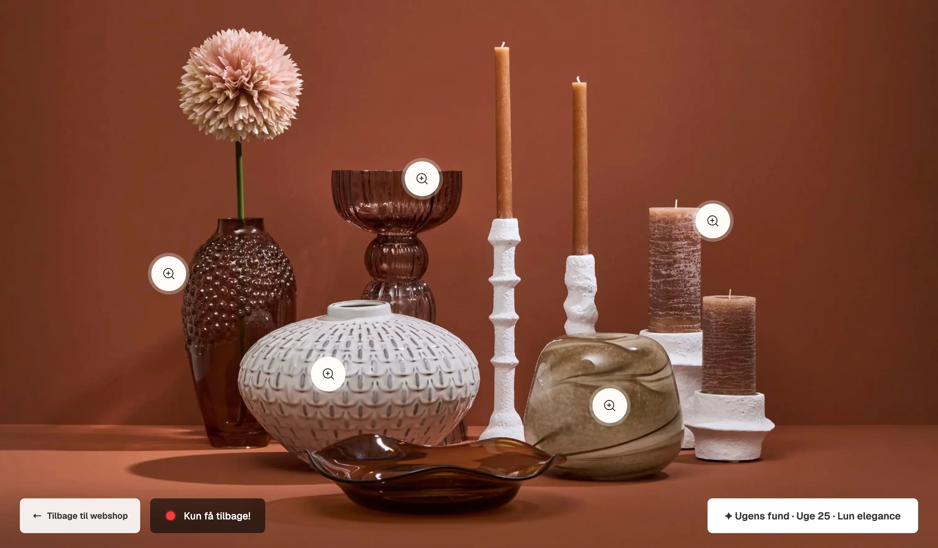
Ugens Fund is presented like a curated store display rather than a traditional product grid, inviting users to explore the scene instead of simply scrolling through a list.
Ugens Fund is presented like a curated store display rather than a traditional product grid, inviting users to explore the scene instead of simply scrolling through a list.
Ugens Fund is presented like a curated store display rather than a traditional product grid, inviting users to explore the scene instead of simply scrolling through a list.
Instead of a normal product list, the find is one full-bleed styled scene with interactive hotspots on each piece. Tap one and a small card surfaces the name and price right there in context; from there you can open the full product.
Instead of a normal product list, the find is one full-bleed styled scene with interactive hotspots on each piece. Tap one and a small card surfaces the name and price right there in context; from there you can open the full product.
Instead of a normal product list, the find is one full-bleed styled scene with interactive hotspots on each piece. Tap one and a small card surfaces the name and price right there in context; from there you can open the full product.
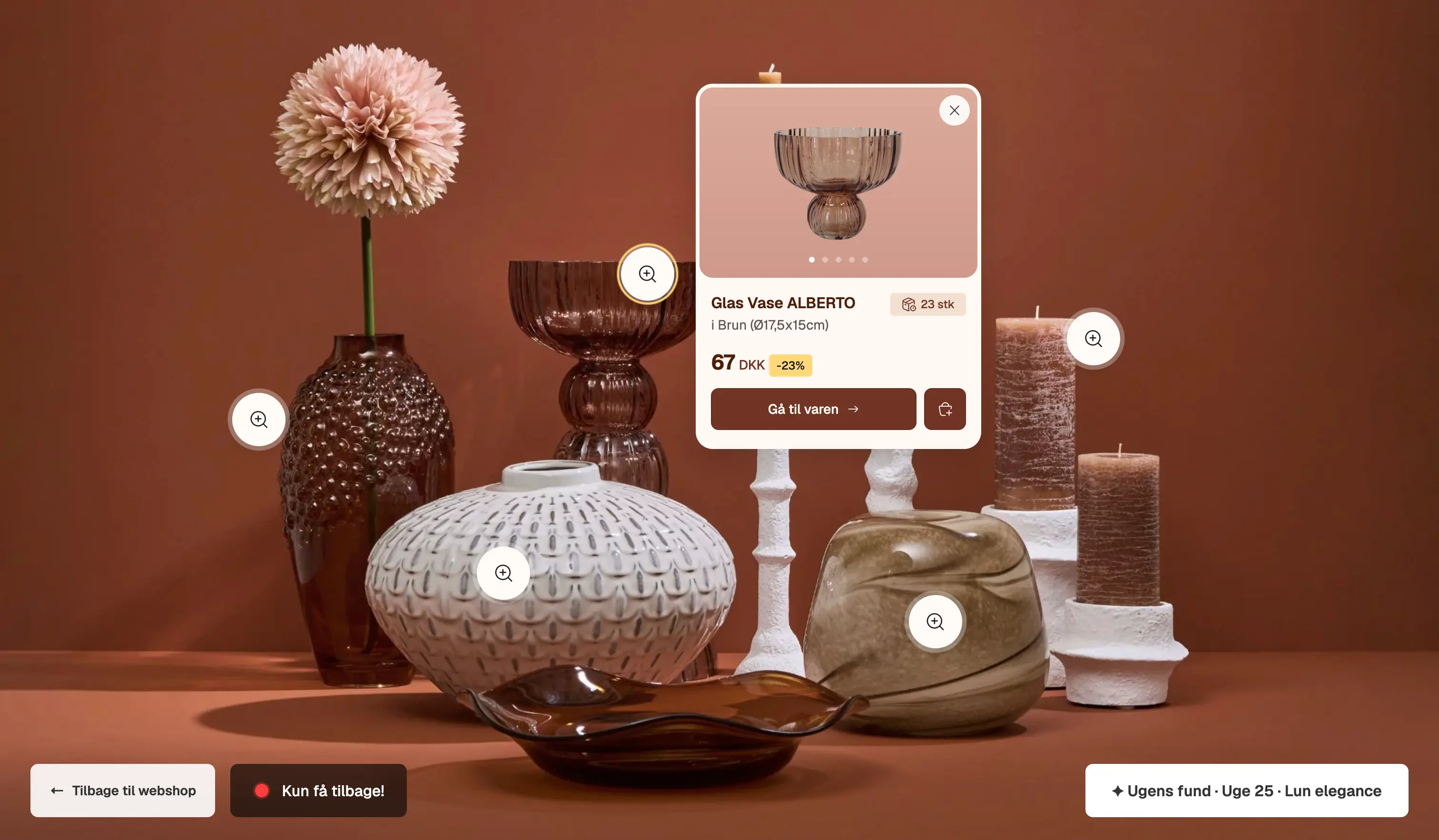
Tapping a hotspot reveals the product within the scene, allowing users to view it in the context of how it has been styled.
Tapping a hotspot reveals the product within the scene, allowing users to view it in the context of how it has been styled.
Tapping a hotspot reveals the product within the scene, allowing users to view it in the context of how it has been styled.
The product itself opens in a modal rather than a separate page, so you never lose the scene you came from. It carries the things our tests said built trust - the price against the usual market price, stock status, and the option to reserve the item for pickup in a specific store. That last detail matters for a restpartier model, where a given piece won’t be in every shop.
The product itself opens in a modal rather than a separate page, so you never lose the scene you came from. It carries the things our tests said built trust - the price against the usual market price, stock status, and the option to reserve the item for pickup in a specific store. That last detail matters for a restpartier model, where a given piece won’t be in every shop.
The product itself opens in a modal rather than a separate page, so you never lose the scene you came from. It carries the things our tests said built trust - the price against the usual market price, stock status, and the option to reserve the item for pickup in a specific store. That last detail matters for a restpartier model, where a given piece won’t be in every shop.

Selecting an item opens its details without taking users away from the styled environment, making key information such as pricing,
availability and in-store reservation easy to find.
Selecting an item opens its details without taking users away from the styled environment, making key information such as pricing, availability and in-store reservation easy to find.
This was the standout moment for testers. The clickable images got called out again and again, and one person even wanted to click through and see a product styled in different rooms - a good sign the idea was landing the way we hoped.
This was the standout moment for testers. The clickable images got called out again and again, and one person even wanted to click through and see a product styled in different rooms - a good sign the idea was landing the way we hoped.
This was the standout moment for testers. The clickable images got called out again and again, and one person even wanted to click through and see a product styled in different rooms - a good sign the idea was landing the way we hoped.
Browsing that doesn’t feel like a form
Testers found the dropdown menus tiring, especially if they’d just come to look around rather than shop for something specific. So the homepage now opens with a visual category grid - small stylised 3D icons sitting next to the usual menus, turning “what are you after today?” into something to scan instead of read. It’s one of the pieces the brand kept after the project wrapped.
Browsing that doesn’t feel like a form
Testers found the dropdown menus tiring, especially if they’d just come to look around rather than shop for something specific. So the homepage now opens with a visual category grid - small stylised 3D icons sitting next to the usual menus, turning “what are you after today?” into something to scan instead of read. It’s one of the pieces the brand kept after the project wrapped.
Browsing that doesn’t feel like a form
Testers found the dropdown menus tiring, especially if they’d just come to look around rather than shop for something specific. So the homepage now opens with a visual category grid - small stylised 3D icons sitting next to the usual menus, turning “what are you after today?” into something to scan instead of read. It’s one of the pieces the brand kept after the project wrapped.
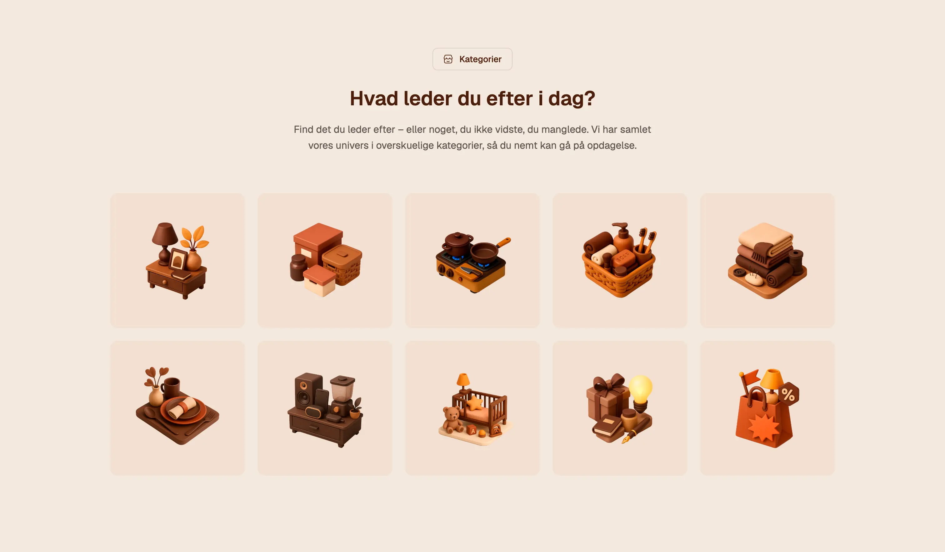
The old dropdown menus felt like a lot of work. So the homepage leads with a visual category grid instead - easier to scan.
The old dropdown menus felt like a lot of work. So the homepage leads with a visual category grid instead - easier to scan.
The old dropdown menus felt like a lot of work. So the homepage leads with a visual category grid instead - easier to scan.

Making the model clear
Our research showed that customers did not fully understand how Basic & More could offer such low prices. Instead of creating excitement, the lack of explanation sometimes made the prices feel suspicious. To address this, we gave the business model its own clear section.
A simple visual comparison shows the same product andre steder and hos os, supported by hand-drawn arrows and annotations. Alongside it, concise copy explains that Basic & More buys job lots, second-quality goods, and overstock directly from established brands, allowing them to offer the same quality at 30-80% below the usual price.
By making the model understandable at a glance, the low prices feel less like a catch and more like a great find.
Making the model clear
Our research showed that customers did not fully understand how Basic & More could offer such low prices. Instead of creating excitement, the lack of explanation sometimes made the prices feel suspicious. To address this, we gave the business model its own clear section.
A simple visual comparison shows the same product andre steder and hos os, supported by hand-drawn arrows and annotations. Alongside it, concise copy explains that Basic & More buys job lots, second-quality goods, and overstock directly from established brands, allowing them to offer the same quality at 30-80% below the usual price.
By making the model understandable at a glance, the low prices feel less like a catch and more like a great find.
Making the model clear
Our research showed that customers did not fully understand how Basic & More could offer such low
prices. Instead of creating excitement, the lack of explanation sometimes made the prices feel suspicious. To address this, we gave the business model its own clear section.
A simple visual comparison shows the same product andre steder and hos os, supported by hand-drawn arrows and annotations. Alongside it, concise copy explains that Basic & More buys job lots, second-quality goods, and overstock directly from established brands, allowing them to offer the same quality at 30-80% below the usual price.
By making the model understandable at a glance, the low prices feel less like a catch and more like a great find.
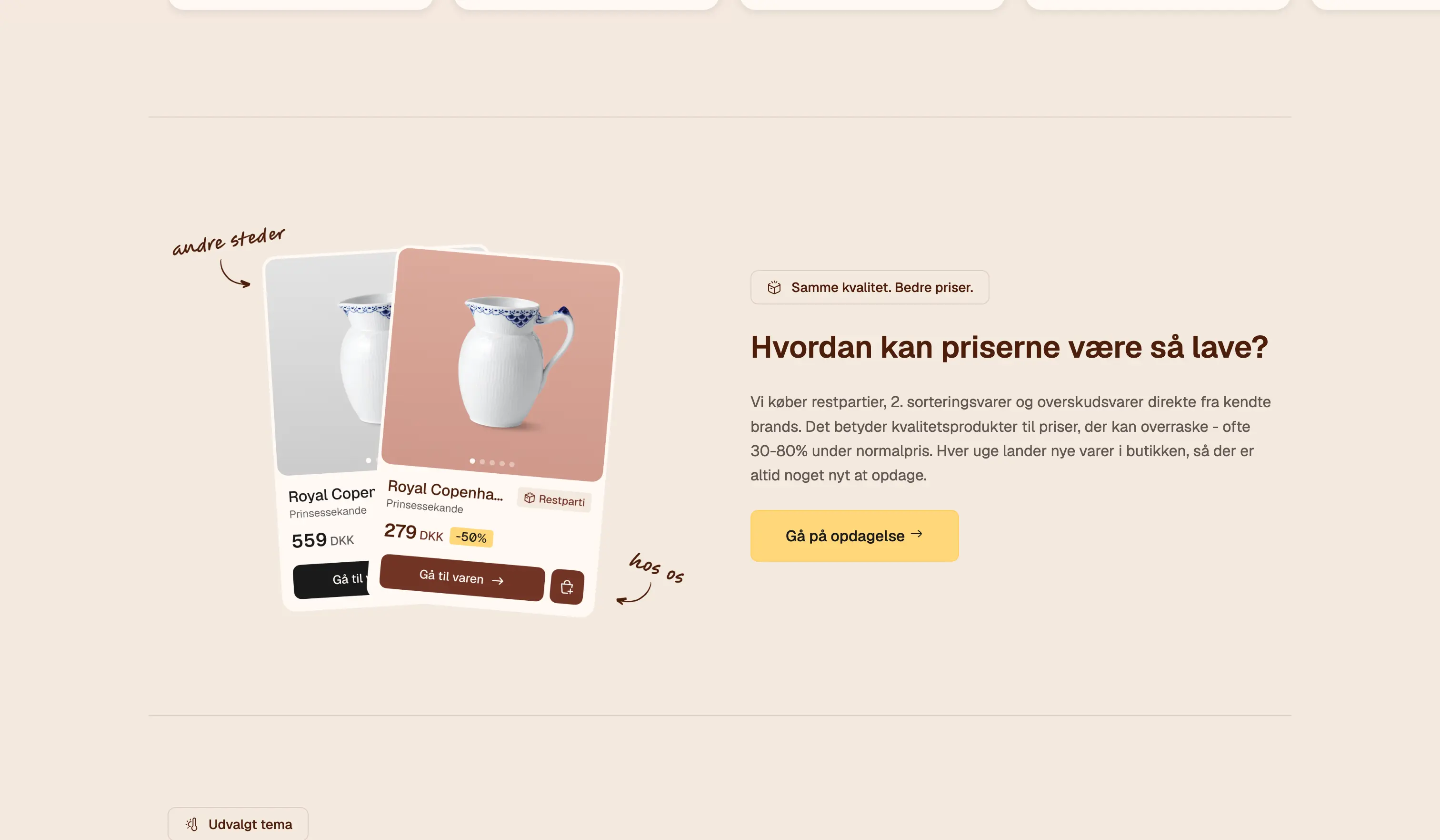
The hand-drawn notes make the information feel approachable and transparent, rather than formal or hidden away.
The hand-drawn notes make the information feel approachable and transparent, rather than formal or hidden away.
The hand-drawn notes make the information feel approachable and transparent, rather than formal or hidden away.
Pointing people back to the shop
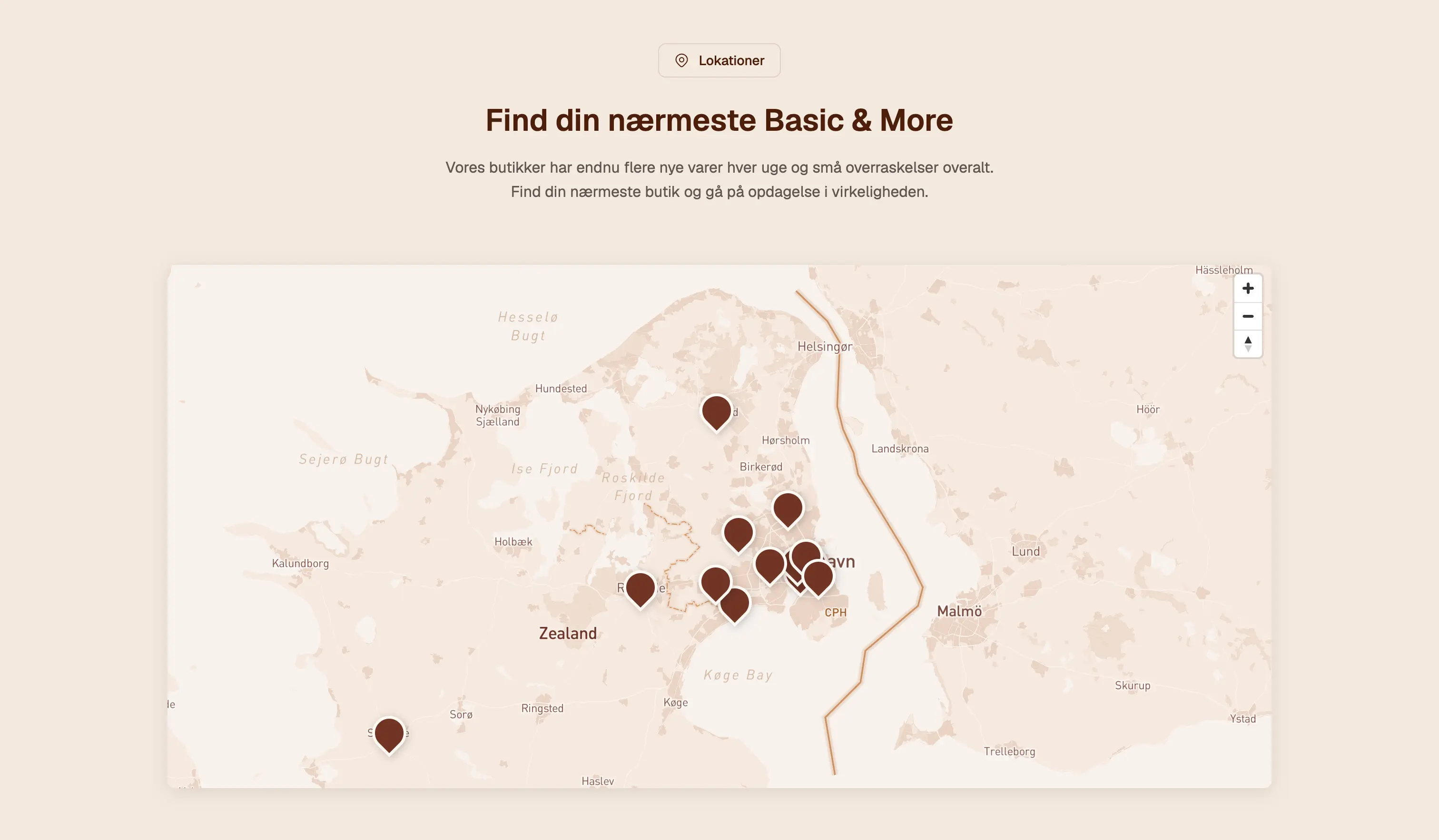
The brand really lives in that space between the physical shop and the screen, so the site keeps nudging people back toward it. A store locator makes it easy to find your nearest Basic & More and go looking in person - especially handy since a given restparti won’t always be sitting on every shelf.
Pointing people back to the shop
The brand really lives in that space between the physical shop and the screen, so the site keeps nudging people back toward it. A store locator makes it easy to find your nearest Basic & More and go looking in person - especially handy since a given restparti won’t always be sitting on every shelf.
Pointing people back to the shop
The brand really lives in that space between the physical shop and the screen, so the site keeps nudging people back toward it. A store locator makes it easy to find your nearest Basic & More and go looking in person - especially handy since a given restparti won’t always be sitting on every shelf.
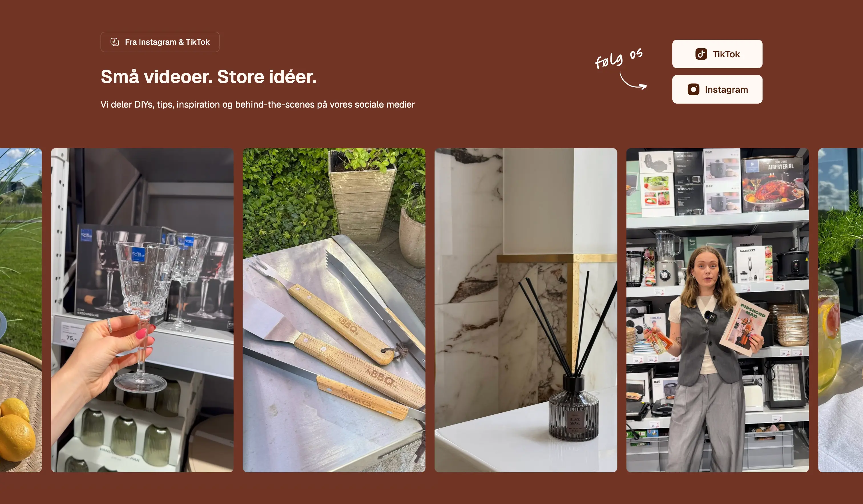
The social section brings the brand’s DIYs, tips, and behind-the-scenes content directly onto the site, keeping it active and engaging between drops.
The social section brings the brand’s DIYs, tips, and behind-the-scenes content directly onto the site, keeping it active and engaging between drops.
The social section brings the brand’s DIYs, tips, and behind-the-scenes content directly onto the site, keeping it active and engaging between drops.